Zumiez redesign
I led a site redesign and mobile optimization project of 15 people; including agency partners, developers, researchers, managers and data analysts for zumiez.com.

The previous home page
The previous category page
The problem
Analysis of site tracking data indicated significant customer drop-off from key shopping destination pages (the home page, category pages), an over reliance on the search functionality, and an under developed mobile experience to convert over 80% of traffic. I conducted a UX site audit to map pain points in the customer journey and opportunities to improve discoverability.
The primary target customer segment is 12 - 22 years old, so an optimized experience for both direct search and browsing what’s new and cool was our goal. I completed a competitive analysis and pitched the design strategy to leadership for sign off on a redesign.
The solution
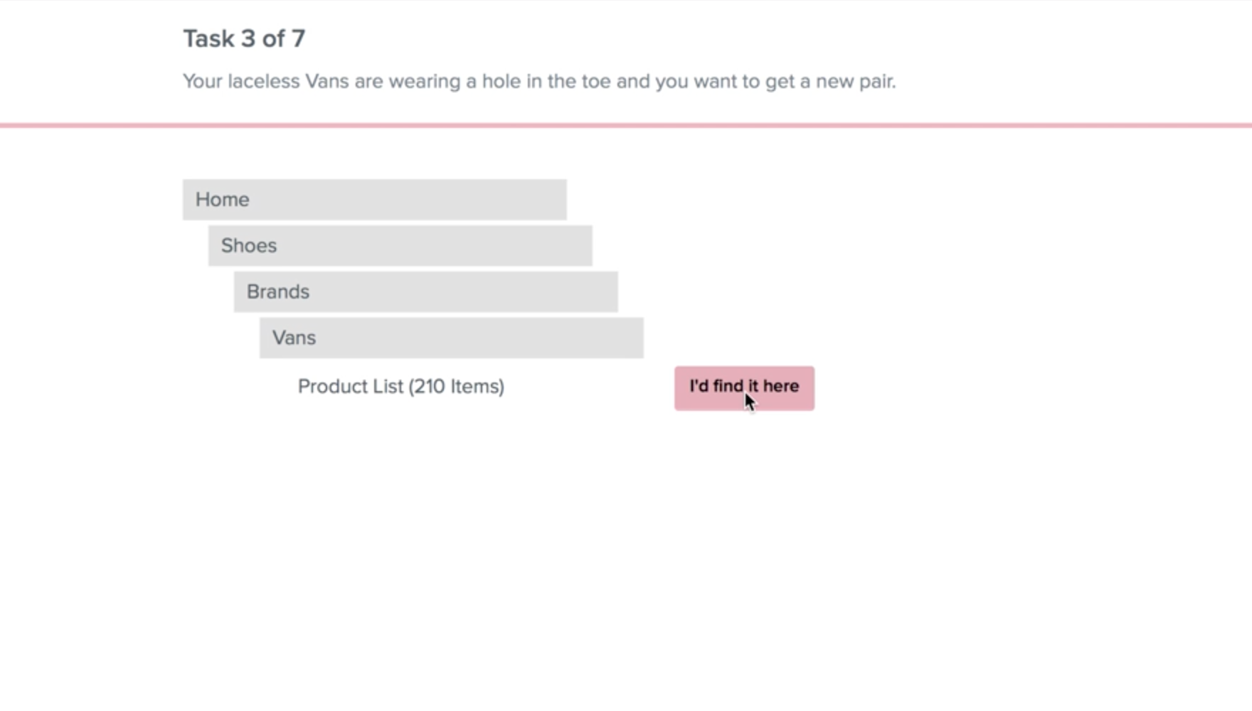
Customer card sort exercise
I conducted a customer usability test with the cooperation of two research partners to better map product categories, subcategories and filters to create a superior information architecture and create a taxonomy guide.
Team brainstorm
I led a workshop sketch session to share the findings from the customer usability testing, gather ideas and align the stakeholders on a shared vision.

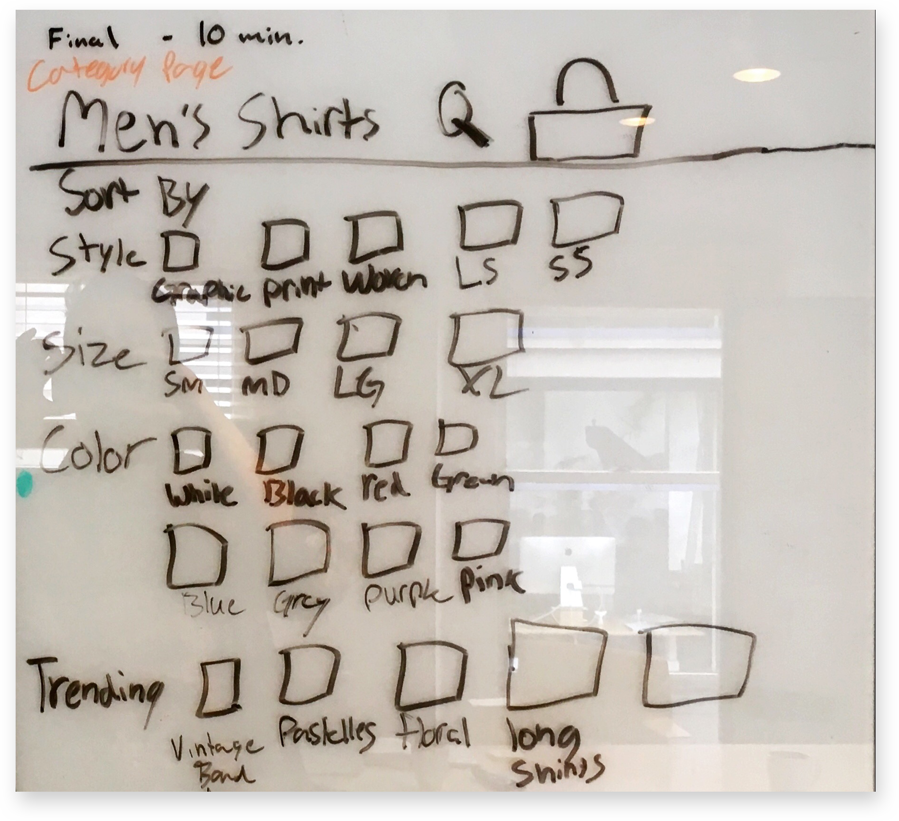
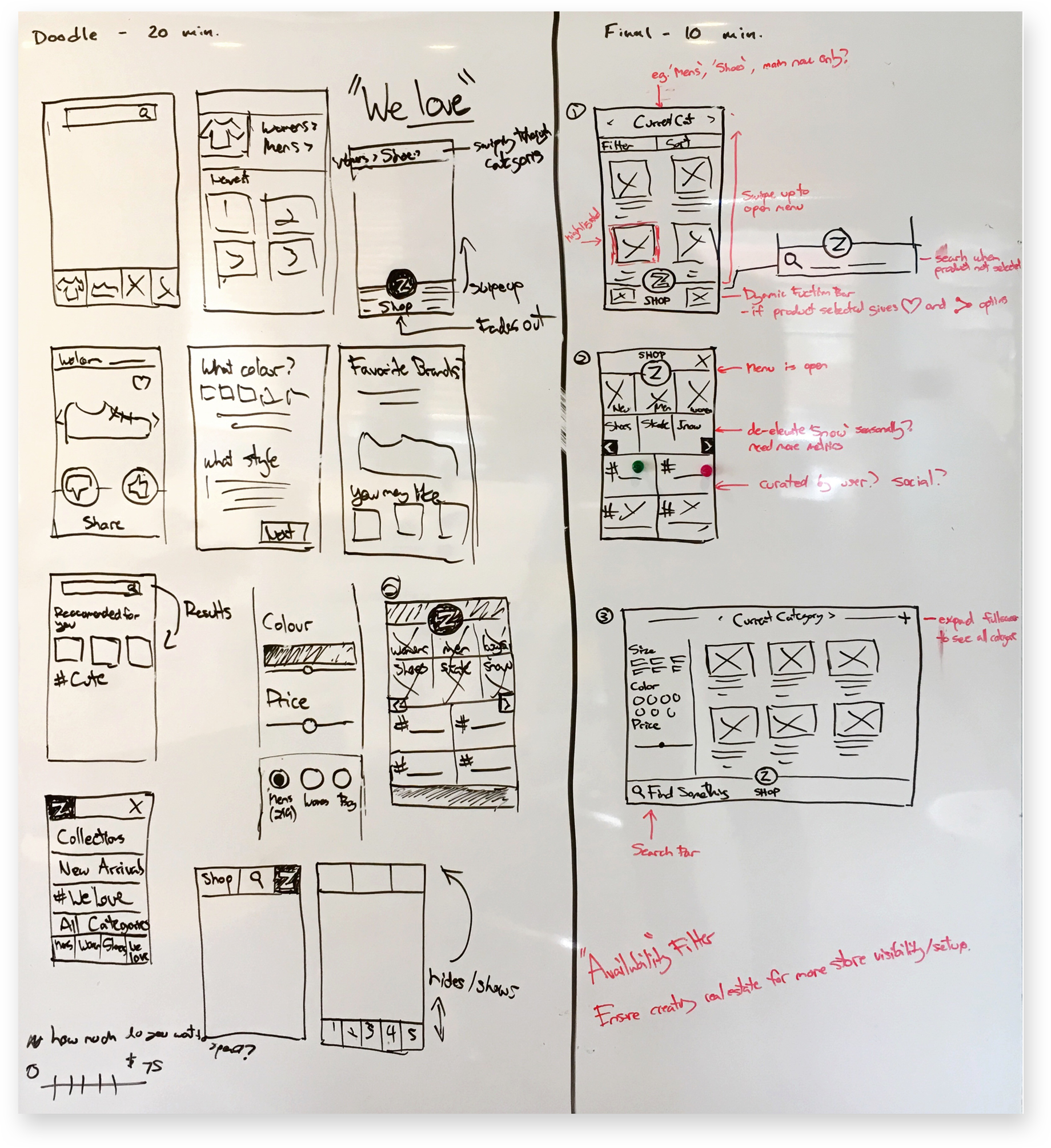

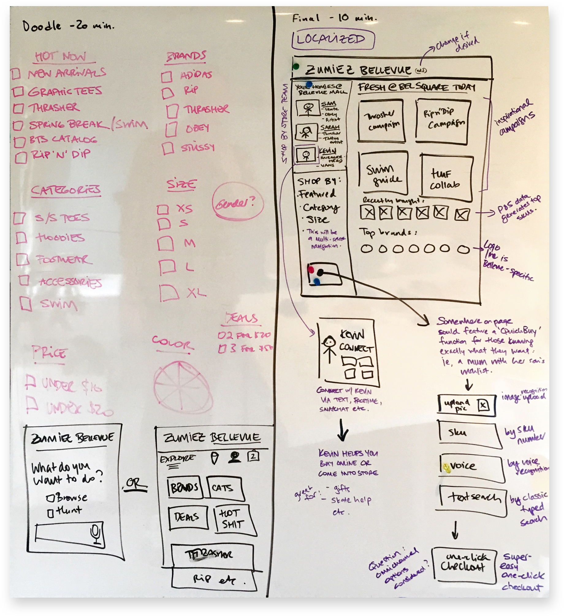
Wireframes
I created desktop and mobile wireframes for the site menu, navigation, shop fronts and filters. Myself and my research partners tested a prototype with customers in store and based on the feedback I created a set of final wireframe designs for the marketing team to skin and worked with the development team to implement.
A critical research finding incorporated into the mockups was the inclusion of gendered identity categories. A hypothesis posed by leadership was that we should do away with gender labels to better serve Generation Z customers. The research insights proved otherwise as customers struggled to navigate the site without the use of gender labels. Users preferred to make a conscious choice to shop via their desired gender of choice.

Mobile homepage

Mobile site menu

Gendered category page

Brand category page

New sample filters

New sample filters optimized for mobile touch

Desktop category page sample

Desktop brands feature page

Desktop brand category page sample
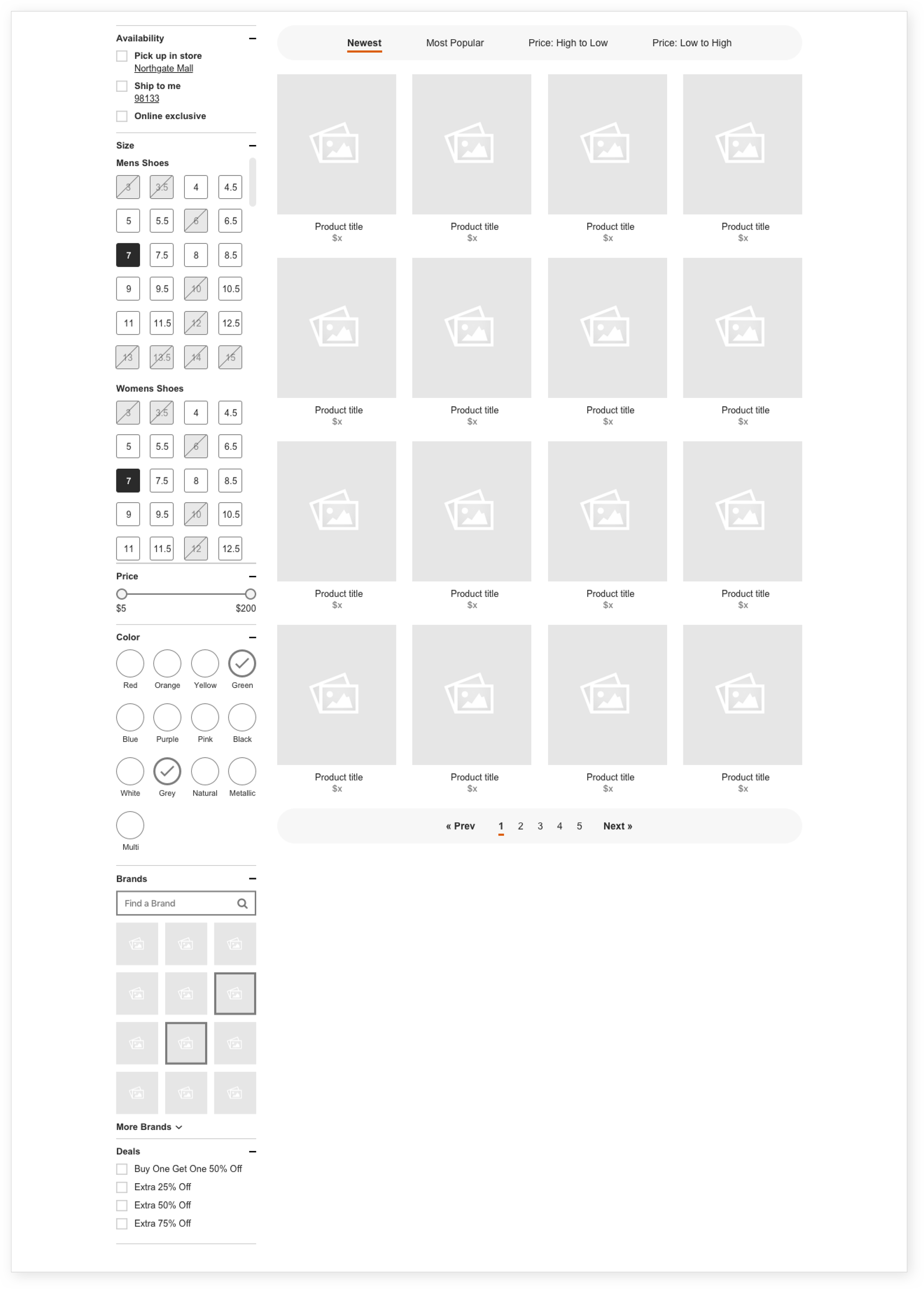
Desktop filters sample
The results
More than 30% increase in revenues as a result of the redesign with a majority of new sales coming from the optimized mobile experience.


