TODAY Show app redesign
I led a mobile app redesign project of 30 people; including agency partners, writers, engineers, researchers, data analysts, product managers, and executive stakeholders for the TODAY Show digital.

The problem
“Too much… the app is just so confusing”
The TODAY Show mobile app doesn’t feel like the TODAY show. Rather than being warm and friendly users found it cold and generic. Users are confused by the app navigation and struggle to find and discover content.The average rating in the iOS App Store is 2.5 stars out of 4 and usage tapers off about initial first day download and usage.
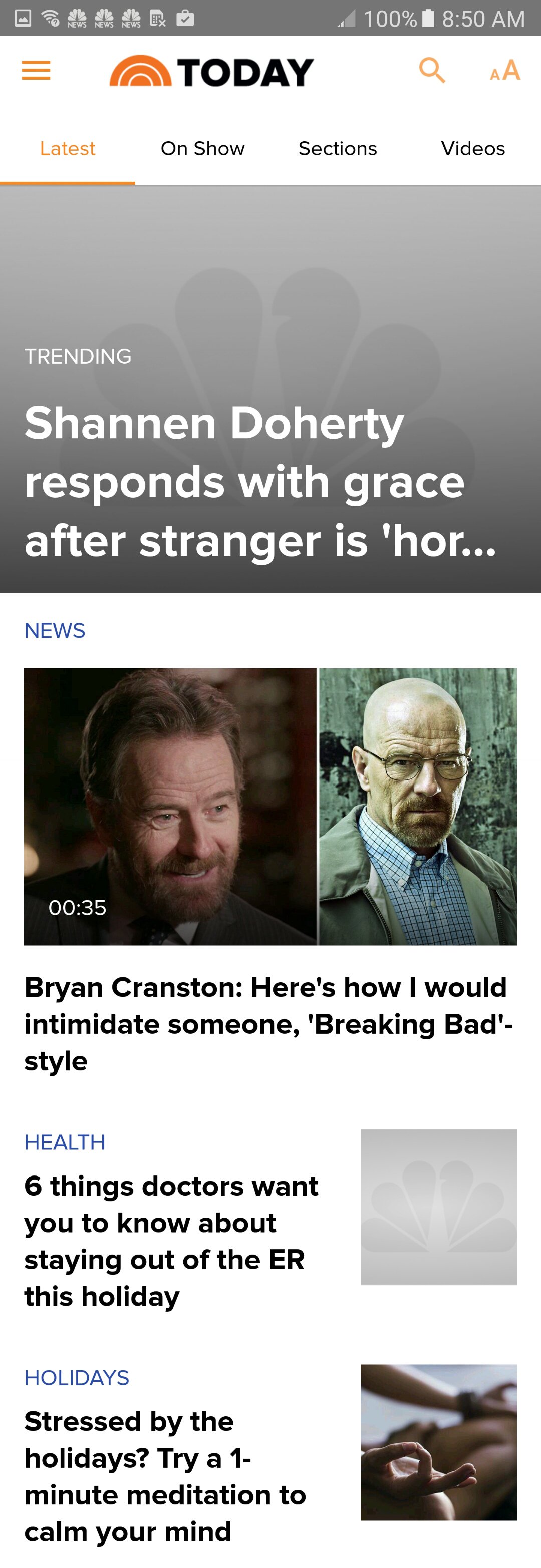
Latest feed

Clips section
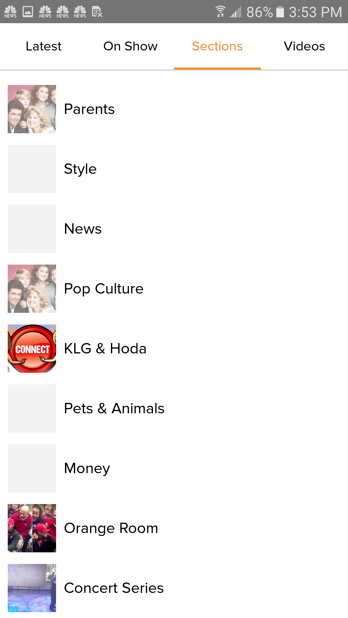
Topic sections

All videos section
The solution
I oversaw a team of user researchers who consulted user interviews and usability studies on the app. Based on the results I pulled out the most relevant insights to create user personas to guide core user journeys.
TODAY Show user personas
App structure
The new navigation would be radically simplified to ease user cognitive load. A new feature we brainstormed to improve daly active usage call the Daily Digest would be first to load on app open.
Wireframes
I created wireframes to explore various interaction models for the new digest feature, the new navigation model, and the redesigned core app pages.

Digest format concept
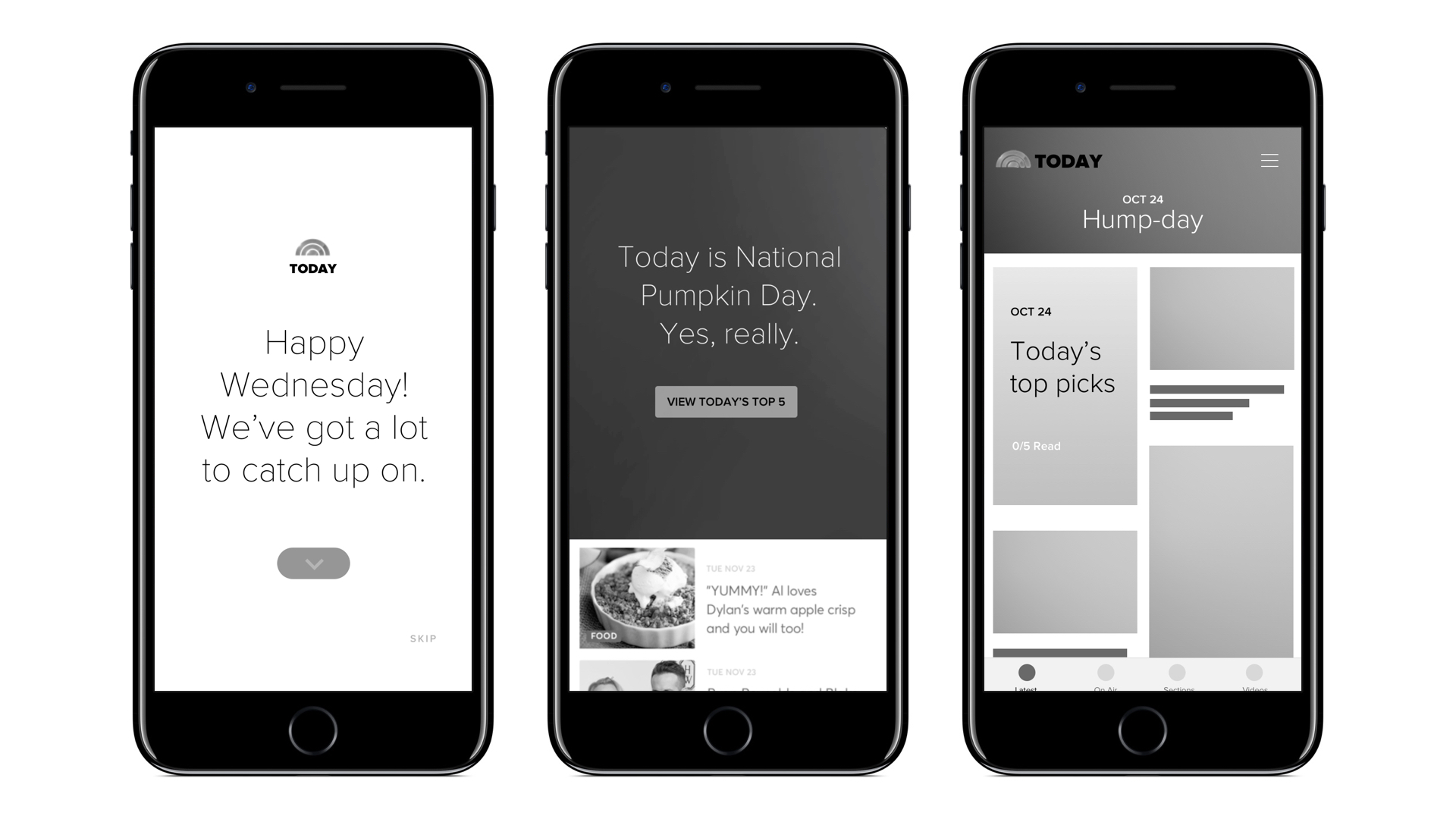
Digest concept version
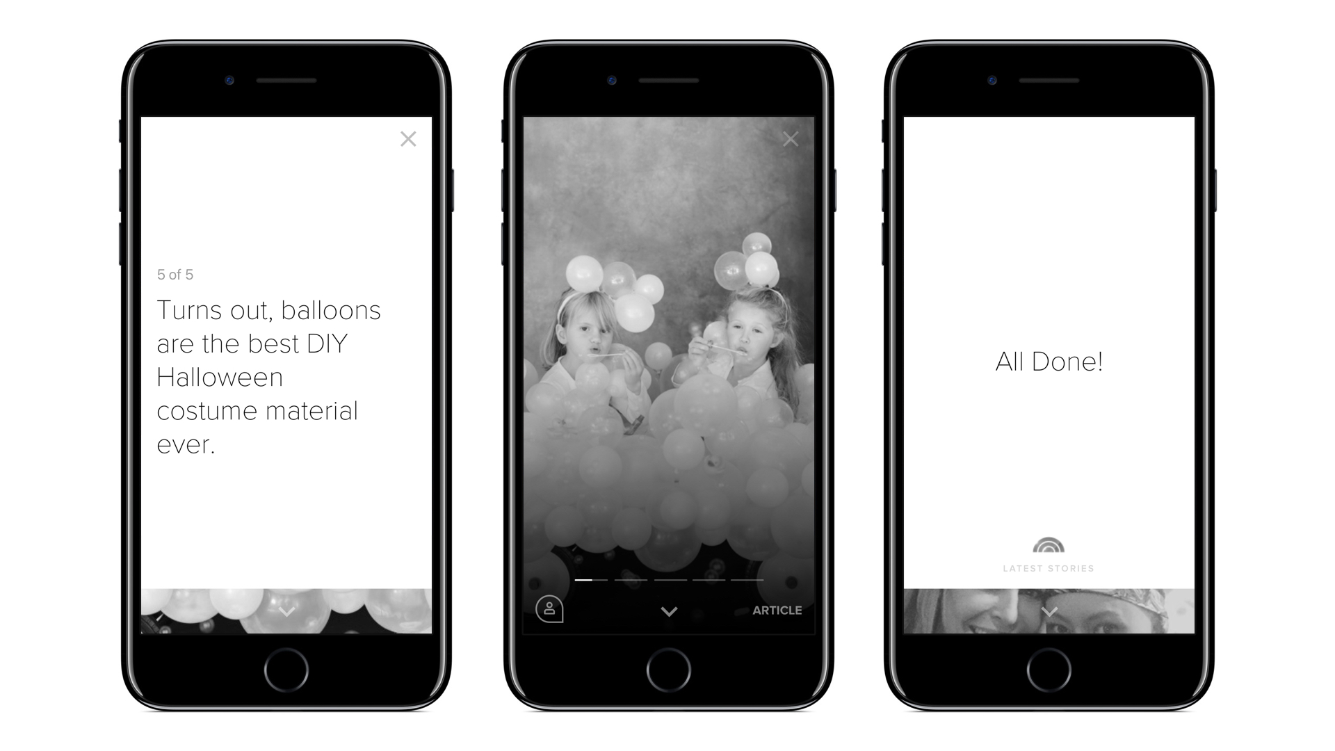
Digest concept version
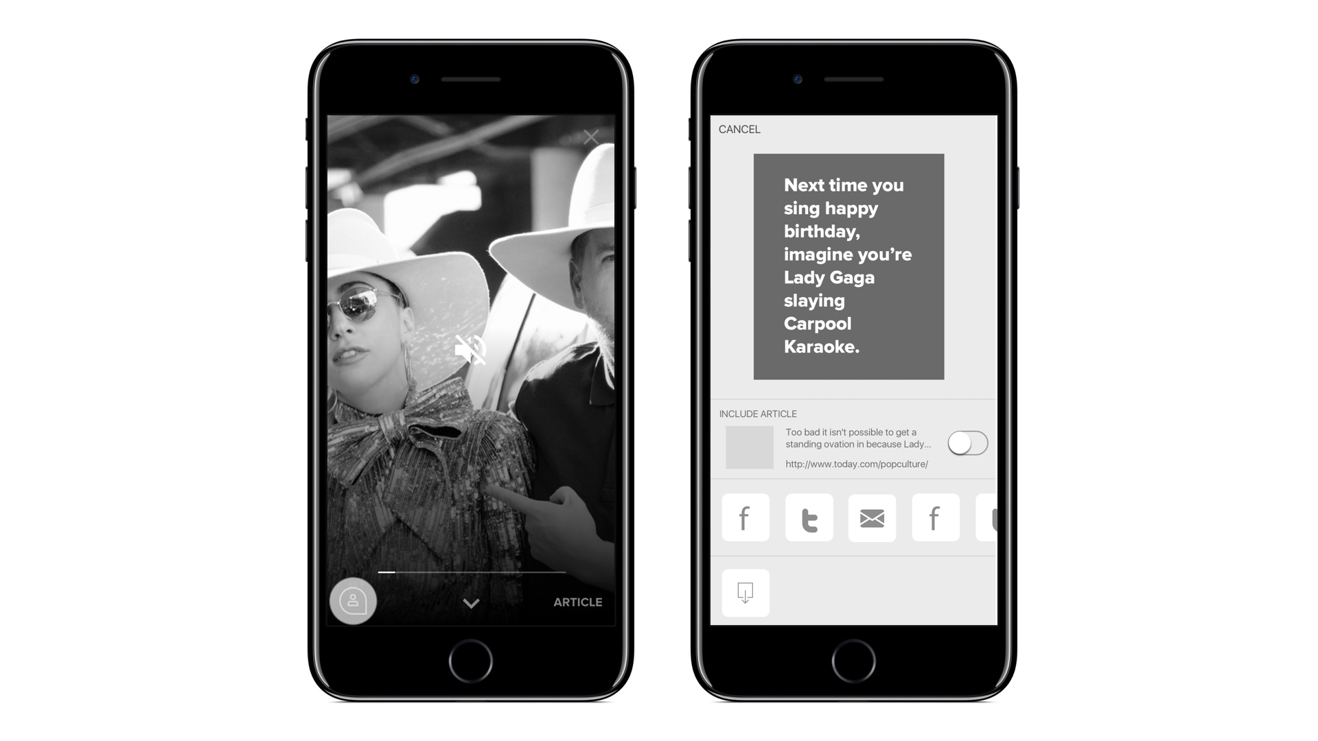
Digest share content concept
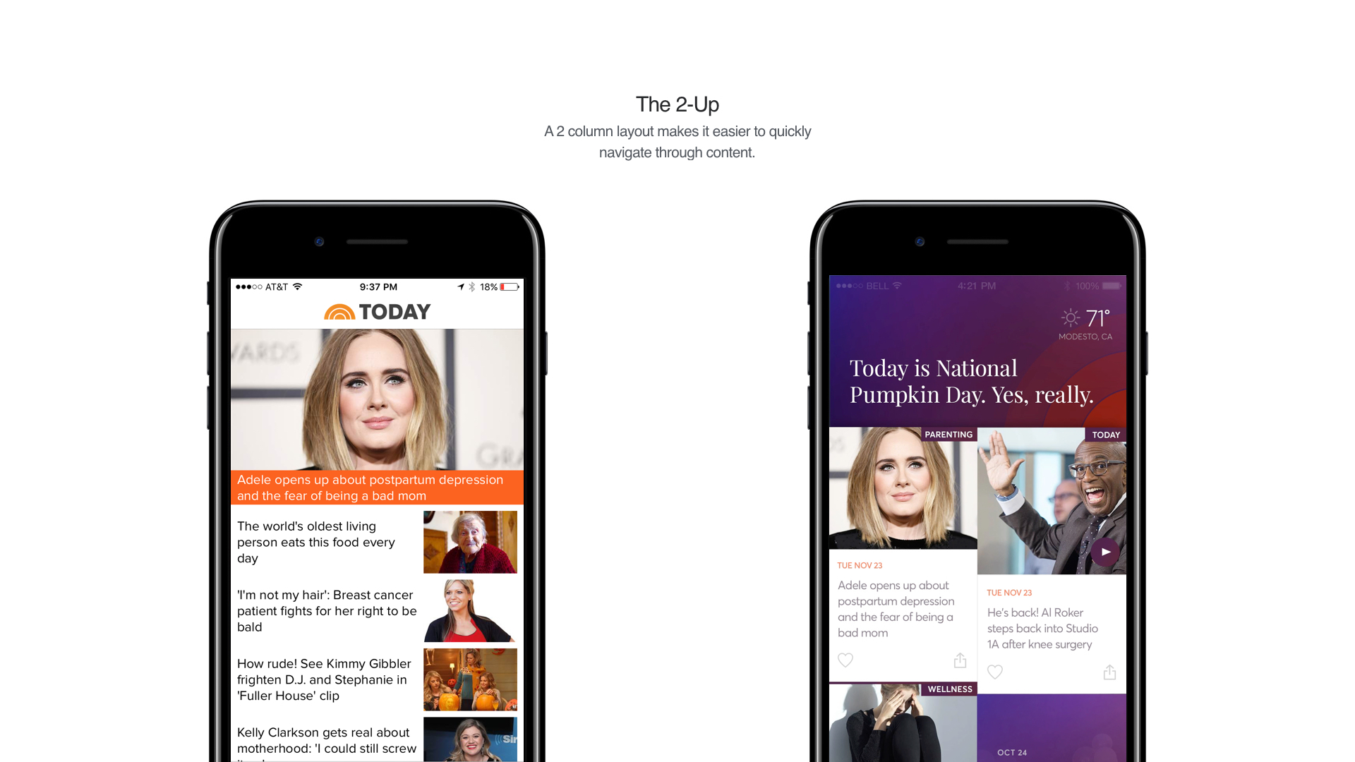
Feed layout concept
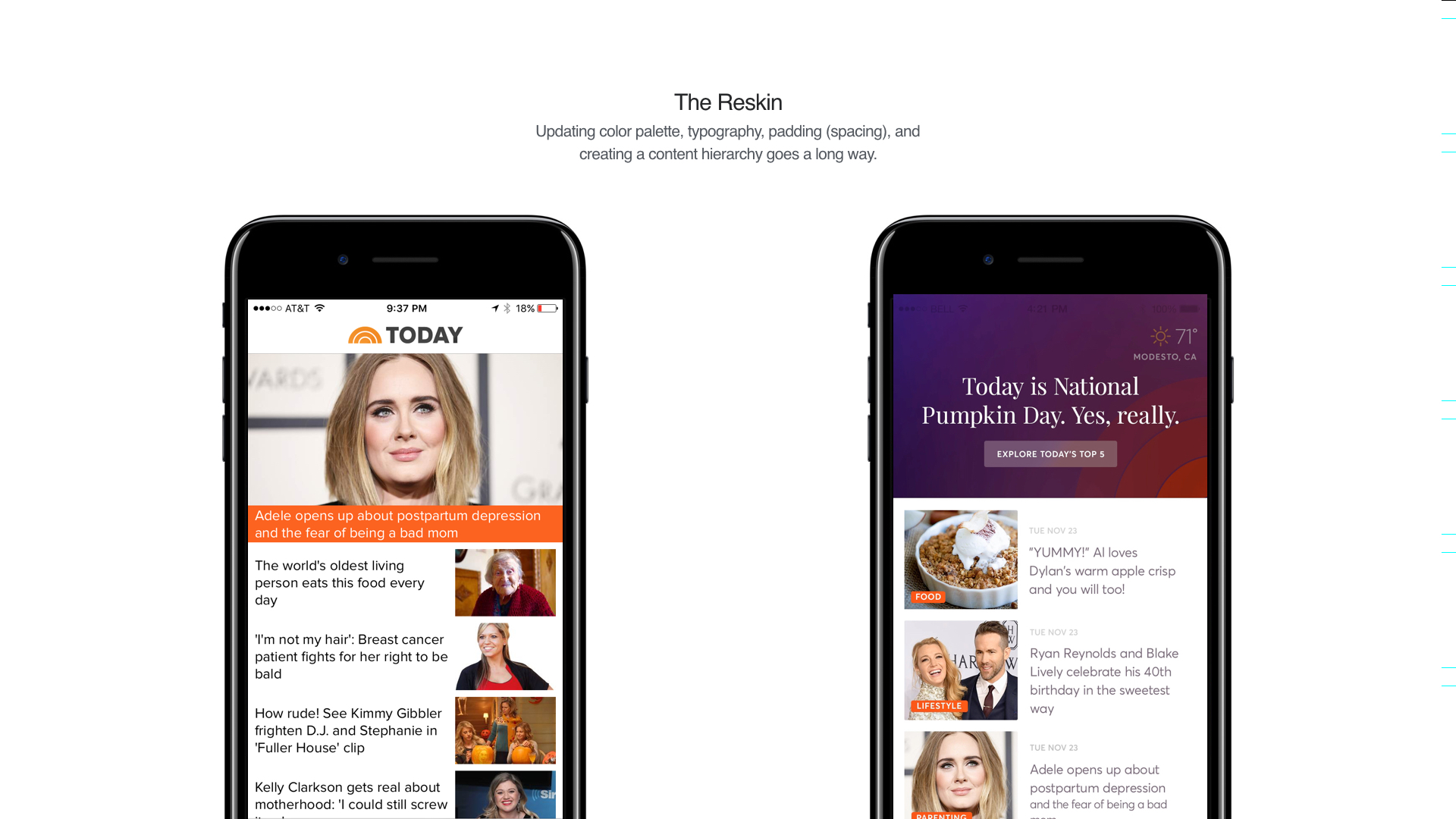
Feed layout concept

Article reskin
Branding
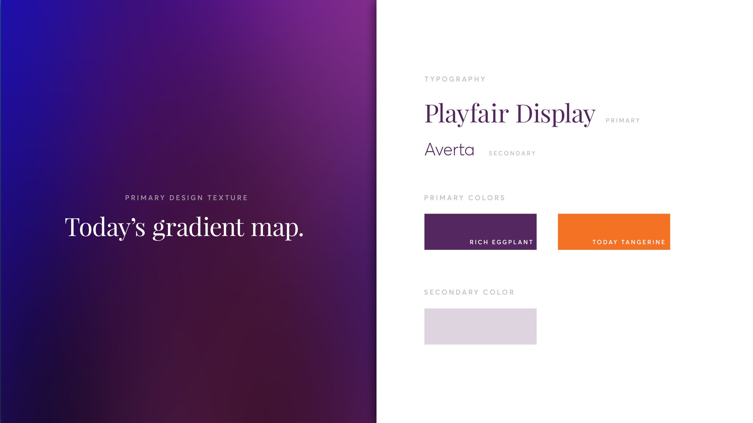
I created a new extensible visual identity for the app elevating its aesthetic and creating a sense of warmth.



Final design
I created design mockups for the core app flows.

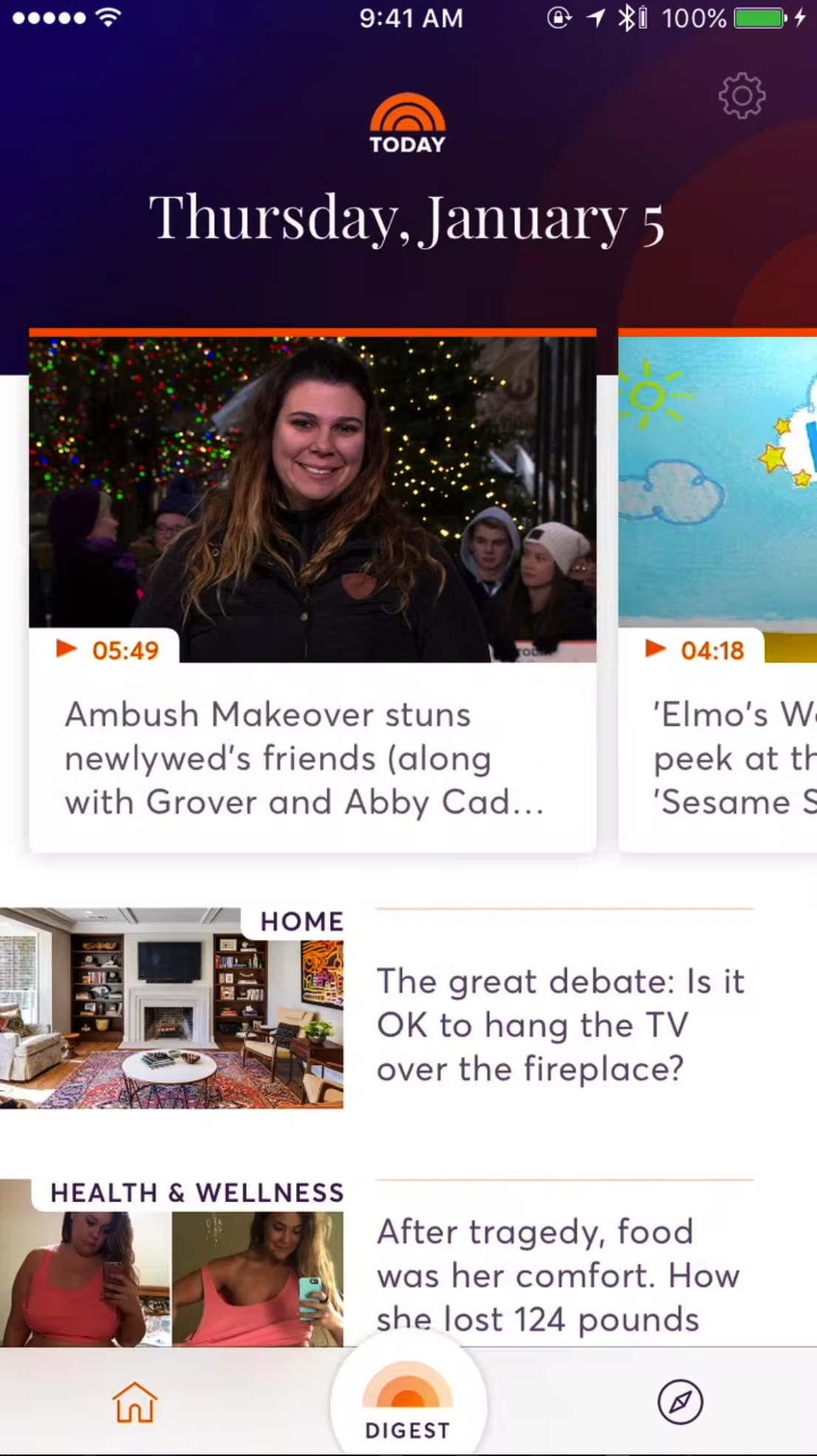
Home feed

Digest launched

Discover and search

Reskin article

Video player
Prototype of the new app launch, browse and discover experience.
The results
Secured 2nd place in the iOS App Store for the news category and won the 2017 EPPY award for best mobile app.
20,000 users grew to over 1M in the first week live.
Average 4 stars out of 5 in iOS app store and 25 positive reviews by the 2nd week live.
